Wake up daily to our latest coverage of business done better, directly in your inbox.
Get your weekly dose of analysis on rising corporate activism.
The best of solutions journalism in the sustainability space, published monthly.
Select Newsletter
By signing up you agree to our privacy policy. You can opt out anytime.
By David Evans
A recent study calculated that air pollution leads to 3.3 million premature deaths per year worldwide and this number may double by 2050. To put that in perspective, only heart disease (7.4 million) and stroke (6.7 million) cause more deaths per year.
Despite these figures, air pollution isn't top of mind when talking about our health. Unlike smoking a cigarette or eating fast food, it’s much harder to recognize when exposure to pollution is impacting our longevity. We see a plume of black smoke rise from an old truck to join the cloud of smog hovering around the skyline, but we don’t really know how it’s impacting our health on a day-to-day basis.
Fortunately, a group of scientists is out to help us visualize air quality on a global level and put it into terms we can easily understand.
The Beijing based group, Air Quality Index China (AQICN), gathers thousands of air-quality data points from over 70 countries and displays them in real time. They’ve released an interactive map that uses a simple color-coded system to provide a snapshot of air quality for locations around the world, quickly painting a picture of air quality.
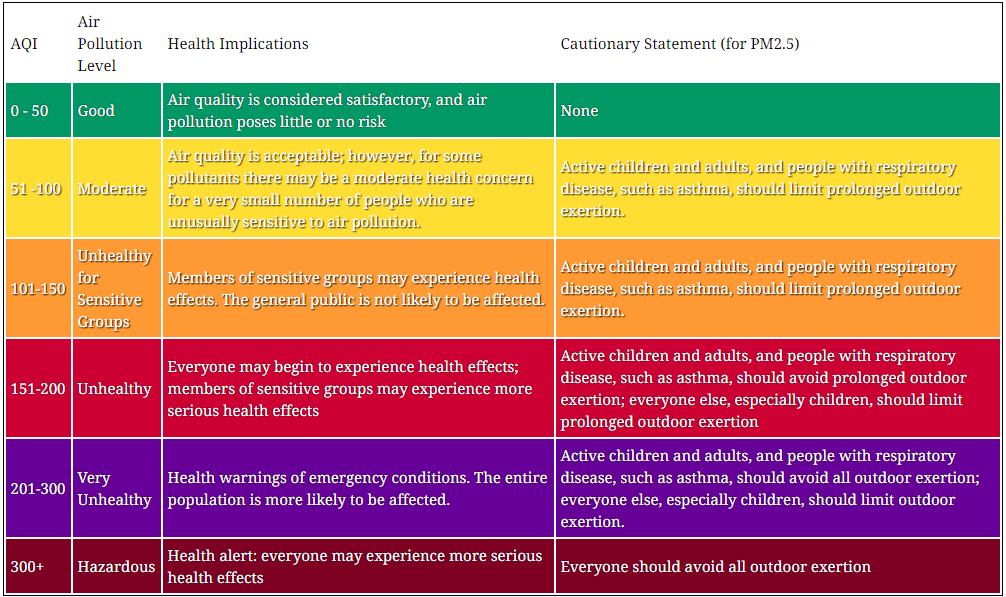
The AQICN rating system of six different classifications ranges from Good to Hazardous, making it easy to recognize good and bad scores. Because this data is updated in real time, you can see what the air quality is near you right now … as long as you’re near a monitoring facility -- most of which are concentrated around big cities.
The data
The data behind this AQI map comes from air quality monitoring stations around the world, each represented by a colored pin. These stations measure particulate matter (PM) and relay their data to AQICN where it is standardized and incorporated into the map.Particulate matter consists of solid particles and liquid droplets which can include dust, dirt, soot or smoke. These particles are tiny -- the largest ones (PM10) are about 30 times smaller than the diameter of a human hair. Particles this small can get deep into your lungs and even into your bloodstream, which is what makes them such a high health concern. Most of the particles tracked measured in the World Air Quality Index are PM2.5.
Because there are varying methods and standards for quantifying air pollution in each country, AQICN uses one standard for all the data it receives: U.S. EPA Instant-Cast. The Instant-Cast is a standardized method used to convert raw pollutant readings measured in µg/m3 or ppb (parts per billion), to the much easier to interpret scale of 0 to 500. From here the index gives each of the six ranges a score and corresponding color which are reflected in the pins shown on the map.
Along with real-time air quality data, AQICN also provides a forecast of air quality up to eight days out. The group's forecast model incorporates weather data to predict the movement of air pollution.
This example provided by AQICN best explains the impact wind has on the air pollution of a city.
"South wind tends to increase the pollution in Beijing: If the wind is not strong enough (i.e. not ventilating enough), then the particules will get blocked by the mountains and will not be able to move further to the north, thus creating a dense particule concentration in Beijing."
"North wind tend to clear the pollution: When the wind blows sufficiently from the North, the air gets almost immediately cleared since there is no "pollution source" in the north (or, at least, much less than in the south)."
What real-time air quality data means for us
While AQICN’s display of air quality data around the world isn’t likely to change our day-to-day lives, it may impact a few of our plans and habits. A hazardous air-quality score for a particular region may sway our vacation plans slightly. I may opt to skip Beijing on my upcoming trip to China ... or maybe pick up a pollution mask -- some of which now come in a variety of colors and designs.More importantly, the power of visualizing data this way can be quite impactful because it opens up the results of science to everyone (in this case it's in real time). We are getting increasingly better about telling stories with data, and while we need to be careful about the motivations of some sources, it’s an amazing way to include the general public in the findings and resulting discussions.
The world AQI is a prime example of how data visualization has the power to take data and turn it into a story. Thousands of data points are turned into a map you can digest at first glance giving us a fast and easy way to see the impact air pollution has on our health. As we continue to collect environmental data and develop the ability to process and display it, the story of our global impact will be clearer and much harder to ignore.
Image credits: 1) WAQI 2) WAQI 3) EPA
David Evans is the founder of prch, a resource for responsible consumers. He is a UCLA graduate with a degree in Environmental Studies and Geographic Information Systems and works in the crossover between tech and conservation. David's mission is to help others improve their environmental and social impact.
TriplePundit has published articles from over 1000 contributors. If you'd like to be a guest author, please get in touch!